+91 7605035757
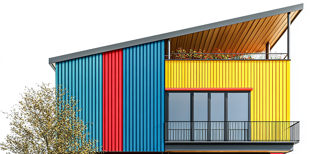
The exterior of a building is its first impression—a reflection of its purpose, personality, and aesthetic values. Choosing the right color palette for your building’s exterior is more than just a design choice; it’s about creating harmony between architecture, surroundings, and function. Whether it’s a commercial building, a residential home, or an industrial facility, the right combination of colors can elevate the appeal and make it a standout structure.
Consider Architecture and Surroundings
When selecting a color palette, consider the building’s architectural style. Traditional structures often look best in neutral or earthy tones that enhance their classic features, while modern designs lend themselves to bold, contrasting hues that emphasize clean lines and minimalism. A colonial-style home, for instance, might look stunning in a soft white or cream paired with dark shutters, whereas a contemporary office could embrace shades of grey with accents of vibrant blue or orange for a striking effect.
Another crucial factor is the surrounding environment. A building that complements its natural or urban surroundings creates a cohesive look. In lush green settings, earthy tones like browns, greens, and muted yellows blend beautifully with the landscape. In urban areas, sleek metallics or monochromatic schemes can resonate with the industrial vibe. On the other hand, coastal buildings benefit from pastel shades inspired by the sea and sky, such as aquamarine, sandy beige, or coral pink.
Functionality and Material Selection
Functionality plays a significant role, too. For instance, commercial buildings often use colors to align with their brand identity, while residential homes prioritize personal taste and neighborhood aesthetics. Industrial buildings may opt for high-visibility colors to ensure safety or lighter shades to reflect heat and reduce energy consumption. The choice of color can also influence perception—muted tones often convey sophistication, while vibrant colors exude energy and creativity.
The material of the exterior surface is another aspect to consider. Colour-coated steel sheets, popular in modern construction, come in a wide range of hues and finishes. Their durability and weather resistance make them an excellent choice for creating bold façades. Similarly, natural materials like stone or brick may require complementary shades to highlight their texture and character.
Lighting and Color Balance
Lighting also impacts how colors appear. A shade that looks perfect in direct sunlight might appear muted or overly dark in shaded areas. It’s wise to test samples in varying light conditions before making a final decision. Additionally, consider how the chosen colors will age over time, as some hues are more prone to fading.
Lastly, balance is key. A well-designed palette typically includes three elements: a dominant color for most of the façade, a secondary color for accents such as trim or shutters, and a bold, contrasting hue for details like doors or signage. The harmony between these elements ensures a cohesive and visually pleasing design.
Conclusion
Choosing the perfect color palette for your building’s exterior requires a blend of creativity, practicality, and awareness of its surroundings. By considering architectural style, function, materials, and lighting, you can create a lasting impression that is as functional as it is beautiful. A thoughtfully chosen palette doesn’t just enhance the building; it transforms it into an integral part of its environment.